Grubber
Redesigning a new food experience from the ground up
ROLE
TOOLS
STATUS
Product Designer
Figma, Figma Make, Claude Code
Shipped in September 2025
USABILITY TESTING
LOGIN FLOW
SEARCH & RESTAURANT CARD
FEED FORMAT
LOGIN COMPLETION
After cutting 6 steps to 3
65%
95%
MIS-TAP RATE
After resizing tap targets
40%
8%
FORMAT PREFERENCE
66.6%
Before locking in the redesign, I ran moderated usability tests with 6 users across the core flows, which are login, search, and restaurant profile.
5 of 6 users hesitated or abandoned by the third screen, citing too many questions before seeing any value. Cut the flow from 6 steps to 3, asking only for core details such as name, number, and email.
Users mis-tapped icons on the restaurant card 40% of the time because of sizing and unclear meaning, so I rebuilt with larger tap targets and it's consistent icon set. Mis-taps dropped to under 10% on retest.
Presented both an Instagram-style media feed and a Twitter-style hybrid feed to the same 100-person user base. 70% preferred the hybrid format, saying they wanted to post quick thoughts without needing a photo every time. This directly shaped the pivot to a more Twitter-style feed.
Preferred Twitter-style feed
CONTEXT
IMPACT
IMPACT
IDENTIFYING THE ISSUE
THE REDESIGN
LOG IN FLOW
NEW PROFILE & FEED
SEARCH FLOW
RESTAURANT PROFILE
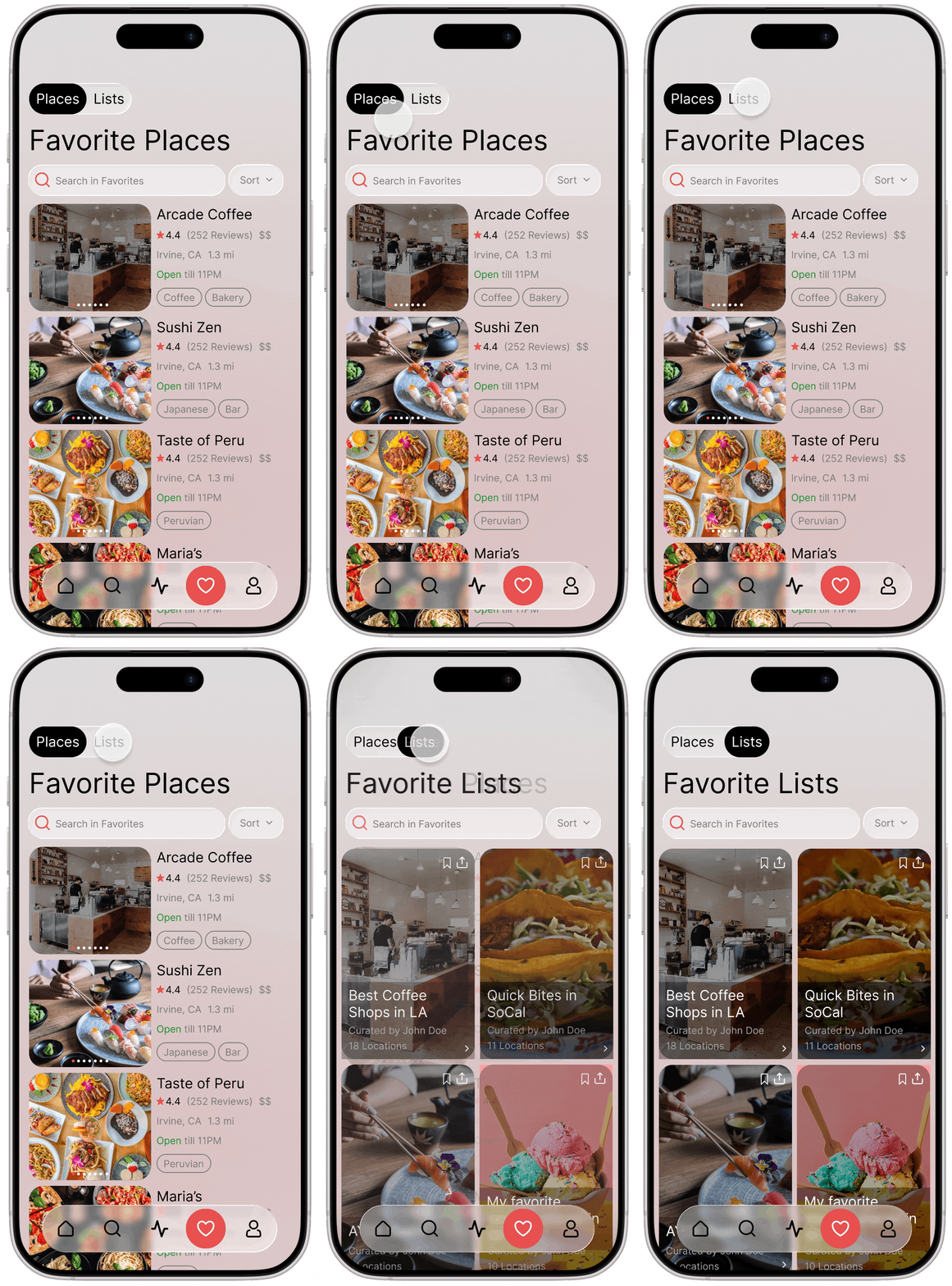
FAVORITE PLACES & LISTS
CURRENT STATE
I was tasked to transform a MVP’s design to a brand new refreshed look. Grubber aims to be an all in one mobile platform for foodies. The app allows you to find new restaurants, follow and share with your friends, and much more.
+25%
+30%
Task Completion
Engagement
After independently auditing the app and identifying the key issues, I aligned with the Grubber team on what needed to change before beginning the redesign from the ground up.
The current login flow asked too many questions and users could quickly get discouraged. I simplified the process, asking only core details.
Originally the app set its focus on a media based more instagram like social feed. Based on their current user base of about 100 people, they decided to switch to a more twitter style feed, allowing a balance of media and text based posts & reviews.
The Search flow in the current application was fine from a functionality standpoint, but it was a bit cluttered so decided to change it for a cleaner look as well as completely change the restaurant search result card.
The Restaurant card had too many random, inconsistent icons, and users experienced usability issues because the buttons and icons were too small.
I updated the lists & favorites screen to match the rest of the app and redesigned the list card.
Immediately when I was tasked to be able to redesign the app, The current state of the app had many UI and UX issues as you can see below.


After independently auditing the app and identifying the key issues, I aligned with the Grubber team on what needed to change before beginning the redesign from the ground up.
Search...
American
Italian
Italian
Chinese


Cho Sun Ok
9.4
9.9
8.5


9.4
Asian Restaurant
(104)
This nice and lovely restuarant has some of my favorite food. I espectially love their lorem ipsem is made for testing to see what 3 lines of description is goi...
63
1.2 mi

OPEN
129


Hottest Grubs in Anaheim






Cho Sun Ok



9.4
129
9.4
9.4
9.4
IS OPEN
Closes at 9:30
1.2 mi
234 Cedar Lane, Seattle

63
Posts
All time
This week
Photos
Recent
DETAILS
Add a Post
Best burgers in LA
Best burgers in LA
Best burgers in LA
Best burgers in LA
18
18
18
8
8
8
these are the must try burger spors in los angees if
uou are visitig...
these are the must try burger spors in los angees if
uou are visitig...
these are the must try burger spors in los angees if
uou are visitig...


Cognitive Overload
Inconsistent UI
Bad Color Palette


HOME
Grubber
Redesigning a new food experience from the ground up
ROLE
TOOLS
STATUS
Product Designer
Figma, Figma Make, Claude Code
Shipped in September 2025
USABILITY TESTING
LOGIN FLOW
SEARCH & RESTAURANT CARD
FEED FORMAT
LOGIN COMPLETION
After cutting 6 steps to 3
65%
95%
MIS-TAP RATE
After resizing tap targets
40%
8%
FORMAT PREFERENCE
66.6%
Before locking in the redesign, I ran moderated usability tests with 6 users across the core flows, which are login, search, and restaurant profile.
5 of 6 users hesitated or abandoned by the third screen, citing too many questions before seeing any value. Cut the flow from 6 steps to 3, asking only for core details such as name, number, and email.
Users mis-tapped icons on the restaurant card 40% of the time because of sizing and unclear meaning, so I rebuilt with larger tap targets and it's consistent icon set. Mis-taps dropped to under 10% on retest.
Presented both an Instagram-style media feed and a Twitter-style hybrid feed to the same 100-person user base. 70% preferred the hybrid format, saying they wanted to post quick thoughts without needing a photo every time. This directly shaped the pivot to a more Twitter-style feed.
Preferred Twitter-style feed
CONTEXT
IMPACT
IMPACT
IDENTIFYING THE ISSUE
THE REDESIGN
LOG IN FLOW
NEW PROFILE & FEED
SEARCH FLOW
RESTAURANT PROFILE
FAVORITE PLACES & LISTS
CURRENT STATE
I was tasked to transform a MVP’s design to a brand new refreshed look. Grubber aims to be an all in one mobile platform for foodies. The app allows you to find new restaurants, follow and share with your friends, and much more.
+25%
+30%
Task Completion
Engagement
After independently auditing the app and identifying the key issues, I aligned with the Grubber team on what needed to change before beginning the redesign from the ground up.
The current login flow asked too many questions and users could quickly get discouraged. I simplified the process, asking only core details.
Originally the app set its focus on a media based more instagram like social feed. Based on their current user base of about 100 people, they decided to switch to a more twitter style feed, allowing a balance of media and text based posts & reviews.
The Search flow in the current application was fine from a functionality standpoint, but it was a bit cluttered so decided to change it for a cleaner look as well as completely change the restaurant search result card.
The Restaurant card had too many random, inconsistent icons, and users experienced usability issues because the buttons and icons were too small.
I updated the lists & favorites screen to match the rest of the app and redesigned the list card.
Immediately when I was tasked to be able to redesign the app, The current state of the app had many UI and UX issues as you can see below.
After independently auditing the app and identifying the key issues, I aligned with the Grubber team on what needed to change before beginning the redesign from the ground up.
Search...
American
Italian
Italian
Chinese
Cho Sun Ok
9.4
9.9
8.5
9.4
Asian Restaurant
(104)
This nice and lovely restuarant has some of my favorite food. I espectially love their lorem ipsem is made for testing to see what 3 lines of description is goi...
63
1.2 mi
OPEN
129
Hottest Grubs in Anaheim
Cho Sun Ok
9.4
129
9.4
9.4
9.4
IS OPEN
Closes at 9:30
1.2 mi
234 Cedar Lane, Seattle
63
Posts
All time
This week
Photos
Recent
DETAILS
Add a Post
Best burgers in LA
Best burgers in LA
Best burgers in LA
Best burgers in LA
18
18
18
8
8
8
these are the must try burger spors in los angees if
uou are visitig...
these are the must try burger spors in los angees if
uou are visitig...
these are the must try burger spors in los angees if
uou are visitig...
Cognitive Overload
Inconsistent UI
Bad Color Palette
HOME
Grubber
Redesigning a new food experience from the ground up
ROLE
TOOLS
STATUS
Product Designer
Figma, Figma Make, Claude Code
Shipped in September 2025
USABILITY TESTING
LOGIN FLOW
SEARCH & RESTAURANT CARD
FEED FORMAT
LOGIN COMPLETION
After cutting 6 steps to 3
65%
95%
MIS-TAP RATE
After resizing tap targets
40%
8%
FORMAT PREFERENCE
66.6%
Before locking in the redesign, I ran moderated usability tests with 6 users across the core flows, which are login, search, and restaurant profile.
5 of 6 users hesitated or abandoned by the third screen, citing too many questions before seeing any value. Cut the flow from 6 steps to 3, asking only for core details such as name, number, and email.
Users mis-tapped icons on the restaurant card 40% of the time because of sizing and unclear meaning, so I rebuilt with larger tap targets and it's consistent icon set. Mis-taps dropped to under 10% on retest.
Presented both an Instagram-style media feed and a Twitter-style hybrid feed to the same 100-person user base. 70% preferred the hybrid format, saying they wanted to post quick thoughts without needing a photo every time. This directly shaped the pivot to a more Twitter-style feed.
Preferred Twitter-style feed
CONTEXT
IMPACT
IMPACT
IDENTIFYING THE ISSUE
THE REDESIGN
LOG IN FLOW
NEW PROFILE & FEED
SEARCH FLOW
RESTAURANT PROFILE
FAVORITE PLACES & LISTS
CURRENT STATE
I was tasked to transform a MVP’s design to a brand new refreshed look. Grubber aims to be an all in one mobile platform for foodies. The app allows you to find new restaurants, follow and share with your friends, and much more.
+25%
+30%
Task Completion
Engagement
After independently auditing the app and identifying the key issues, I aligned with the Grubber team on what needed to change before beginning the redesign from the ground up.
The current login flow asked too many questions and users could quickly get discouraged. I simplified the process, asking only core details.
Originally the app set its focus on a media based more instagram like social feed. Based on their current user base of about 100 people, they decided to switch to a more twitter style feed, allowing a balance of media and text based posts & reviews.
The Search flow in the current application was fine from a functionality standpoint, but it was a bit cluttered so decided to change it for a cleaner look as well as completely change the restaurant search result card.
The Restaurant card had too many random, inconsistent icons, and users experienced usability issues because the buttons and icons were too small.
I updated the lists & favorites screen to match the rest of the app and redesigned the list card.
Immediately when I was tasked to be able to redesign the app, The current state of the app had many UI and UX issues as you can see below.
After independently auditing the app and identifying the key issues, I aligned with the Grubber team on what needed to change before beginning the redesign from the ground up.
Search...
American
Italian
Italian
Chinese
Cho Sun Ok
9.4
9.9
8.5
9.4
Asian Restaurant
(104)
This nice and lovely restuarant has some of my favorite food. I espectially love their lorem ipsem is made for testing to see what 3 lines of description is goi...
63
1.2 mi
OPEN
129
Hottest Grubs in Anaheim
Cho Sun Ok
9.4
129
9.4
9.4
9.4
IS OPEN
Closes at 9:30
1.2 mi
234 Cedar Lane, Seattle
63
Posts
All time
This week
Photos
Recent
DETAILS
Add a Post
Best burgers in LA
Best burgers in LA
Best burgers in LA
Best burgers in LA
18
18
18
8
8
8
these are the must try burger spors in los angees if
uou are visitig...
these are the must try burger spors in los angees if
uou are visitig...
these are the must try burger spors in los angees if
uou are visitig...
Cognitive Overload
Inconsistent UI
Bad Color Palette
HOME